UI Update
Crystals Of Irm » Devlog
Hey and hello!
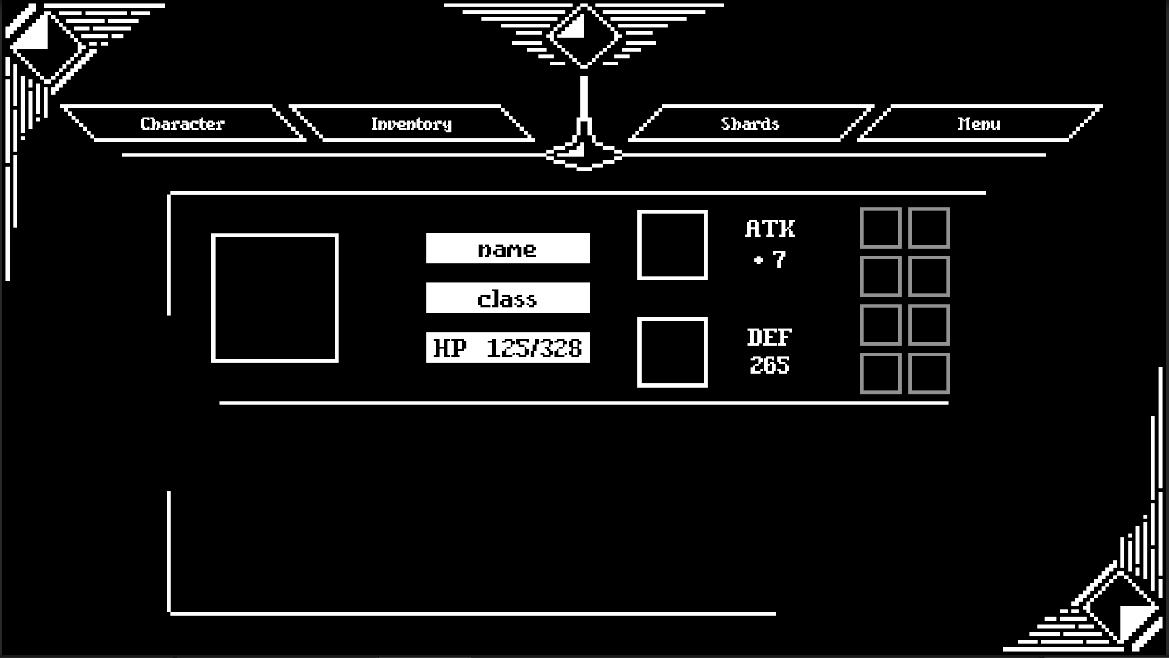
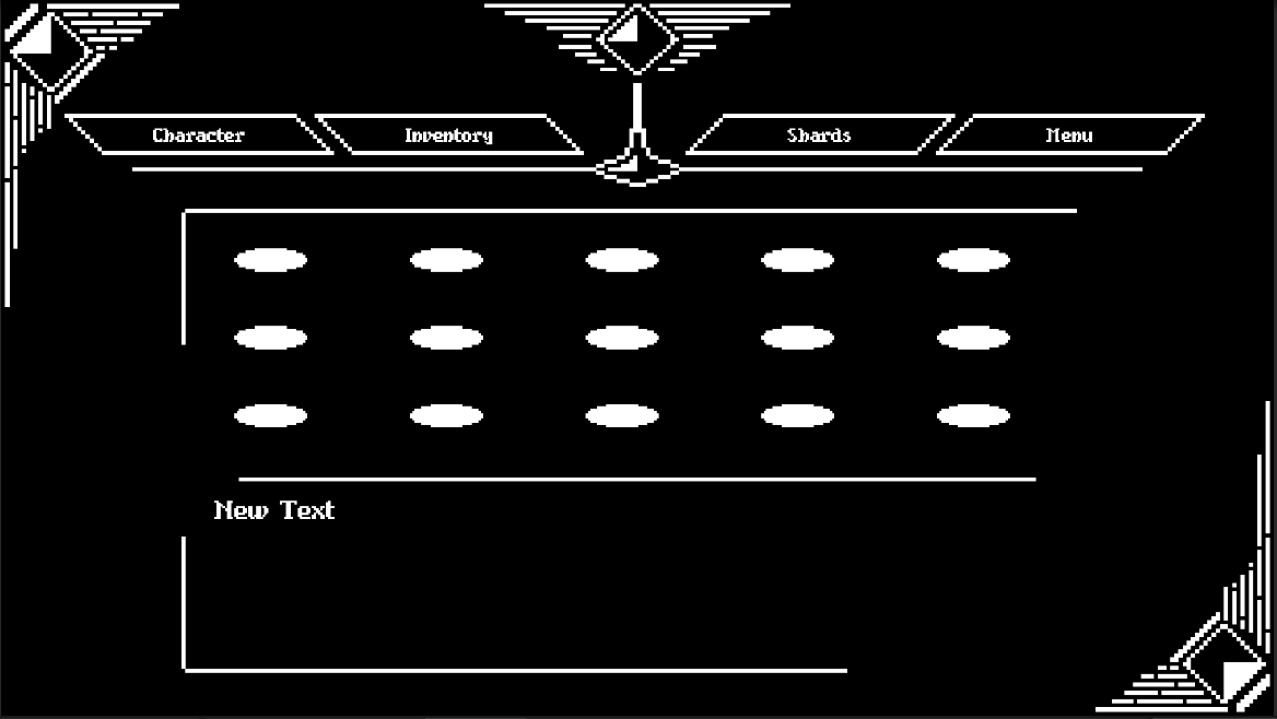
today is a fast one! I started this week to completely rework the previous user interface. I didn't like the prototype of the UI and I was not satisfied with the handling. The new UserInterface covers all important functions and should be as easy to use as possible. There are now four categories - the character menu, the inventory, a shard inventory and a setup menu. This covers all previous systems and you can equip your heroes from there.
The whole thing looks like this so far, unfortunately nothing moves there yet... that will come in the next step!

Stay healthy and we'll read you again next week!
David // LotsOfStuff
Crystals Of Irm
An retroish RPG
| Status | In development |
| Author | LotsOfStuff |
| Genre | Role Playing |
| Tags | 1-bit, 2D, Lo-fi, Unity |
More posts
- Preparing the Ko-Fi of Irm relaunchJun 15, 2025
- Crystals Of Irm - Steam Next Fest 2023Feb 06, 2023
- It's saturday!!!Aug 06, 2022
- Hello againAug 15, 2021
- Strong foundationAug 01, 2021
- Dev TimeJul 25, 2021
- A good wayJul 18, 2021
- Game ModesJul 11, 2021
- Piece by pieceJul 04, 2021
- Progress Pt 2Jun 20, 2021

Leave a comment
Log in with itch.io to leave a comment.